3DLayout-documentation
ezzing3DLayout
PV planning tool - API Documentation
Table of contents
- Introduction
- Screenshots
- 3DLayout Interface
- Buildings
- Areas
- Subareas
- Keepouts
- Trees
- Drawing with Snaps
- Textures
- Shortcuts
- Progress bar
- Layout Coordinate Systems
- How to use
- 3DLayout Communication System
- Alert widgets
- Progress bar customization
- Custom panels
- Layout Rules
- Changelog
- v3.25.0 (2020-03-24)
- v3.24.0 (2020-02-10)
- v3.23.0 (2019-11-20)
- v3.21.0 (2019-09-23)
- v3.20.0 (2019-08-29)
- v3.19.0 (2019-08-09)
- v3.18.0 (2019-06-03)
- v3.17.1 (2019-05-29)
- v3.17.0 (2019-05-13)
- v3.16.0 (2019-04-30)
- v3.15.0 (2019-04-02)
- v3.14.0 (2019-03-11)
- v3.13.0 (2019-02-13)
- v3.12.0 (2019-02-07)
- v3.11.0 (2019-01-17)
- v3.10.0 (2019-01-08)
- v3.9.2 (2018-12-11)
- v3.9.1 (2018-12-05)
Introduction
Ezzing 3DLayout is a PV planning tool that allows you to generate a 3d model of a building based on a satellite image. You can model any number of buildings, select between up to five different type of roofs, define keepouts and trees with custom heights…
Inside each roof area you can customize different structures, select module models and get automated previews of your setup.
It also provides you with a perspective view and a sun simulator to determine where the shadows will be in your installation.
Ezzing 3DLayout is an embebible webapp. You can integrate it inside your own system and customize many elements inside, from module models to prefered default settings for each roof type.
In this document you will find a brief showcase of the different areas of the app, a technical explanation on how to integrate this webapp inside your platform, a full description of the API that will allow you to communicate with the 3DLayout, and finally a description of how to customize different parts of the app.
You can test the app by visiting this link:
https://layout.ezzing.com/#/demo
Screenshots
3DLayout Interface
The 3DLayout interface has two diferent parts: the aside panel and the canvas area.
Aside Panel
In the aside panel you can find functionalities related to the current active building and other objects in the scene.
Canvas Area
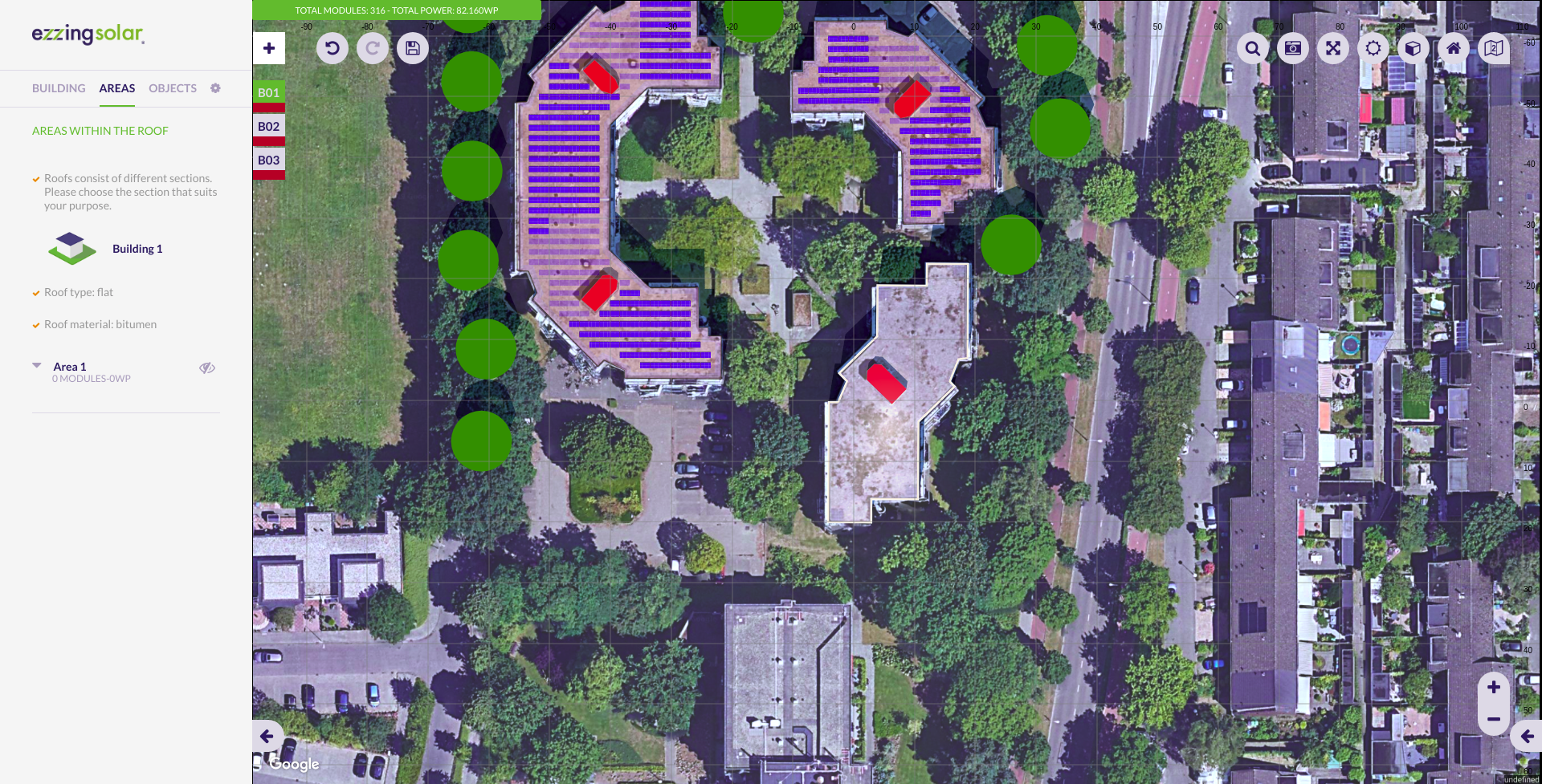
In the canvas area you can see the satellite view and three different sets of elements: the buildings index on the top-left side, the main options buttons on the top-right, and the control buttons on the bottom-right corner.
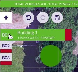
Buildings Index
In the buildings index you can see the active building and select another one to become active. The color represented on each index is the color of the building.
Main Options
These are the main options in the canvas area:

All these buttons are the main options custom buttons. You can customize this set of buttons by hidding some of them, by sorting them, or by adding new buttons.
The default custom buttons are:
- Undo/Redo
- Save: saves the layout in crm
- Search address: moves the project center to the address specified
- Snapshot: takes a photograph of the project (with or without modules in jpg format, or in svg format)
- Fullscreen
- Sun simulation: sun and shadow simulation
- Perspective view: switches to 2D/3D view
- Renderer
- Satellite provider selector (only showed if available)
Please, visit the section Custom Buttons to learn how to add your own buttons.
Control Buttons
These are map related buttons. You can also customize the upper section of this set of buttons by hidding some of them or by adding new buttons.

Fixed buttons in this area:
- Zoom in
- Zoom out

3D control custom buttons:
- Compass: centers 3D view to north
- Geolocation: centers 3D view to the project
- Zoom in
- Zoom out
Please, visit the section Custom Buttons to learn how to add your own functions.
Notifications
Everytime an operation is being executed, it will appear at the top of the canvas a bar with the name of that operation. Its color represents the type of notification:
- Red: error
- Orange: warning (you should wait until the operation is finished)
- Green: success
- Blue: info

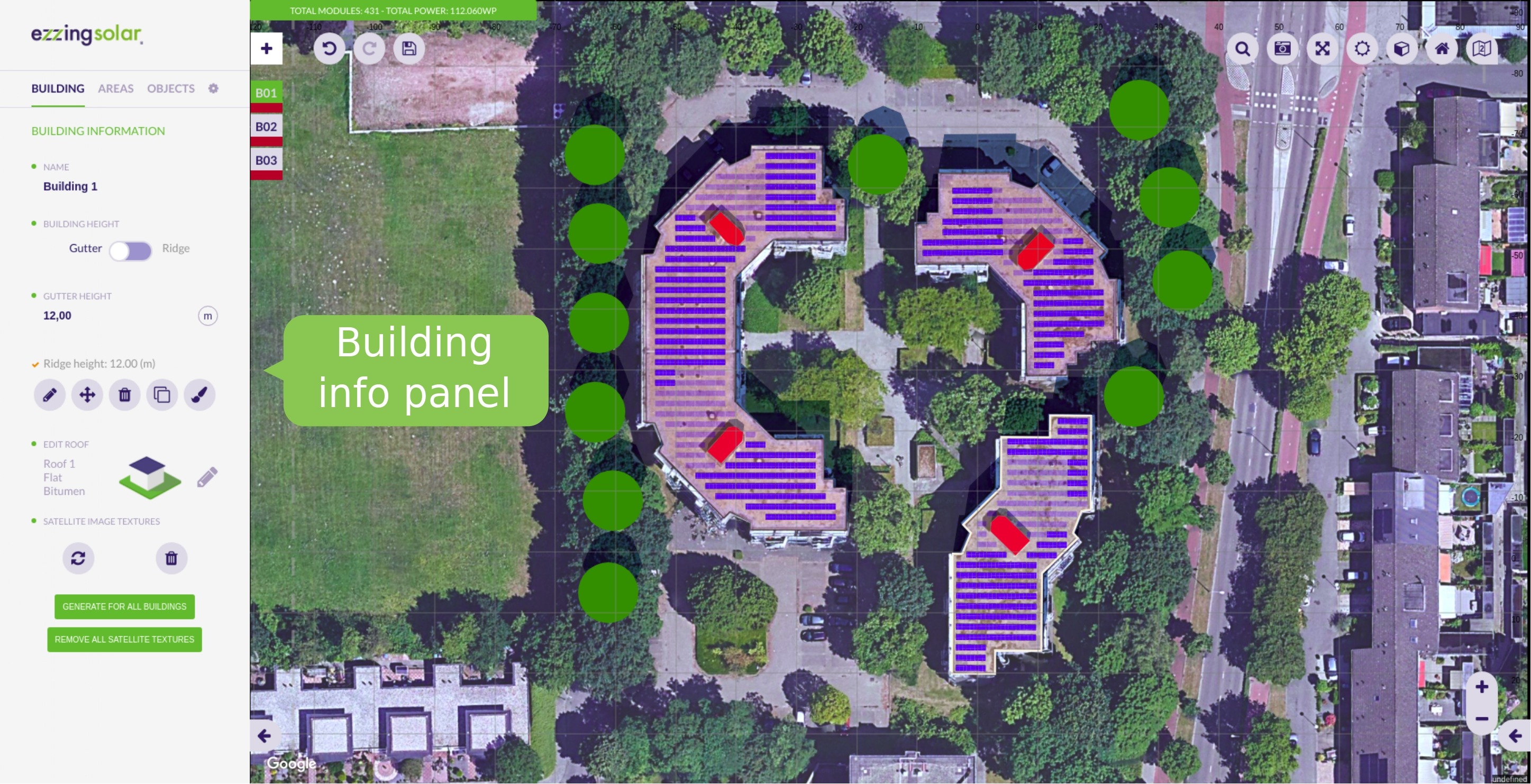
Buildings
Building creation
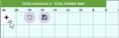
To start using the tool you need to create your first building. To do so you can either click on the start button in the aside panel or in the ‘+’ icon, in the top left corner inside the canvas area. There is no limit on the number of buildings to create.
Since v3.24.0, once you click to create a new building, you will be prompted to choose which mode to use, there are available two ways of creating buildings:
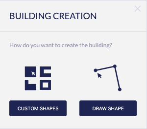
Custom shapes
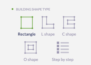
Custon Shapes lets you quickly create a building from a predefined set. This mode is designed to quickly add buidings to the project with common shapes. The current ones are:
Once you select one it will be created in the project center. You can tweak this custom shape from the aside panel (note that the canvas points can’t be edited as they’re grayed out). Configure the size of the edges and the building rotation in the panel. Clicking on Finish you will proceed to edit the building as regular one (see next section Draw Shape). Once the building is created you can move it like any other building to the desired place.
Special mention to the Step by step type. This powerful option lets you define a bulding wall by wall:
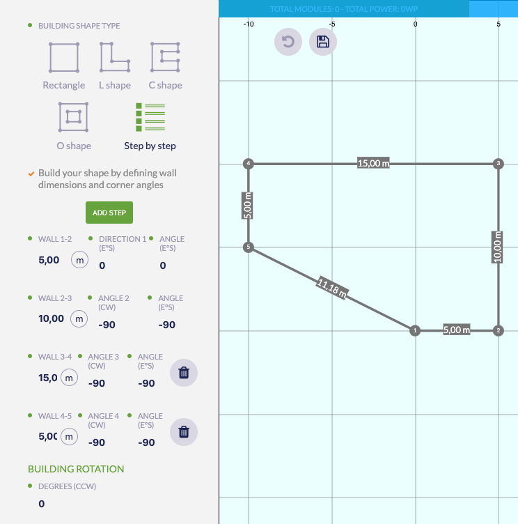
In the example above the user has configured the settings of 4 walls with their respective lengths and angles, plus a closing wall from the first to the last point. The closing wall is calculated automatically so you don´t have to worry about it.
To add a new wall you only need to click the Add Step button in the panel, the new wall will be listed below the ones already there and you can set it up as you wish.
Draw shape
Draw shape: the conventional way of creating buildings, in this mode you have to click on the canvas tu add each of the points that will define the shape of your building.
Please, visit the section Drawing with Snaps to learn how to draw.
Keep in mind that the different parts of the user interface serve different purposes:
- In the canvas area, you will be able to customize the shape of the building by clicking in the desired places.
- In the aside panel, you will be able to change options such as ‘Populate with modules’ and ‘Building height’.
The ‘Building Height’ input can be configured to:
- Gutter: the height will be measured from the floor to the lowest point of the roof.
- Ridge: the height will be measured from the floor to the peak of the roof. Is the place where usually two (or more) opposing planes meet.
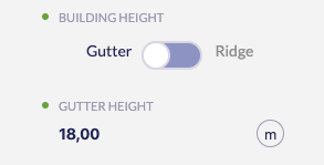
Change height units clicking on the current units to the right of the height number.
The ‘Populated with modules’ option determines if the building will be created with or without modules. It is useful to deactivate it for simulating the shadows of the buildings.
You can activate the modules in the building edition (this configuration will be shown everytime the layout is loaded) or enabling the corresponding area in the area section.

Please, visit the section Drawing with Snaps to learn how to draw.
The next step once you have drawn the building is setting up the roof. There are different types of roofs depending on the shape of the building (if the building is irregular, the roof can only be flat or pent).
These are all the types of roof (available on regular buildings):
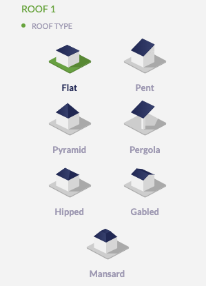
Each roof is composed of a determined number of areas that are automatically created.
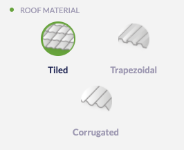
You can also choose a roof material despite it is only informative. The material options are common for all roof types (tiled, trapezoidal, and corrugated):
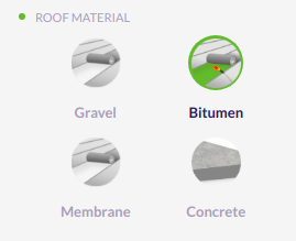
Except for the flat roof type (gravel, bitumen, membrane, and concrete):
When the operation is finished, the textures of the building are generated using the mapper tool and the modules appear in a default subarea.
Please, visit the section Textures to learn how they are generated.
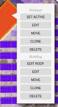
Once the building is created, you will be able to:
- Edit
- Move
- Remove
- Clone (it will be cloned with the same settings)
- Paint
Select building
By clicking in the buildings indexes, below the add building button (‘+’ icon), you can select them. The selected building will become the active one and the canvas will be centered on that building. This is very useful when you are on a projects with several buildings and you want to focus your view on one. After selecting a building, the aside panel will show the properties of the building.
Edit building
You can select between editing the building or editing the roof.
In the first option you can modify the building vertices following the steps of the building creation. If you edit the roof you can select any type of roof and it will be recalculated.
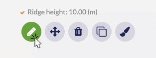
Roof editor
You can edit a roof by clicking in the pencil icon in the roof section:
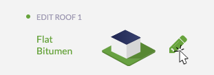
After that, you can change the roof type in a similar way as you did when creating the building. To know the interactions available in each roof type, read the draggable help window that displays the interactions with each roof:
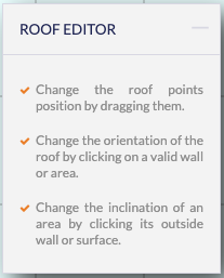
You can click on the upper right corner to minimize the helper if you need more available space to work.
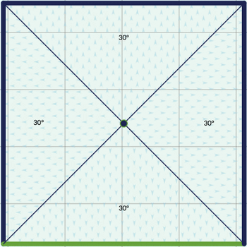
Pent and pergola
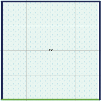
Lets you modify the angle of inclination by clicking somewhere inside the roof and changing the angle. You can change the orientation of the roof by clicking one of the roof edges and selecting “Change Orientation”.
Pyramid
Similar to pents but this roof has four faces instead of one and you can move the top vertex (the peak of the pyramid) to adjust to the desired shape.
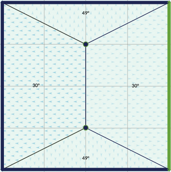
Gabled
Gabled roofs lets you move the edge of the ridge along the whole roof base. You can also change the inclination of the planes as with previous roofs. To change the orientation of the ridge you can click on one edge (like with pent roofs) or using the icons in the aside panel called: East/West or South/North.
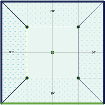
Hipped
Similar in options to a gabled roof, but slightly more complex. The main difference is that in hipped you have two vertex that define the ridge of the roof (the edge at the peak). There’s a switch in the aside panel to ensure the symmetry of the ridge.
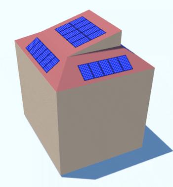
Mansard
The first time you convert a roof to a mansard you’ll see that a basic mansards is like a pyramid roof that has the upper part sectioned.
In a mansard roof, besides the inclination settings available in other roof types, it is possible to change the size of a four-sided ridge. If the symmetric ridge switch in the panel is on, the ridge will have a perfect square ratio.
After clicking Finish with a mansard roof, you will see two roofs in the aside panel:
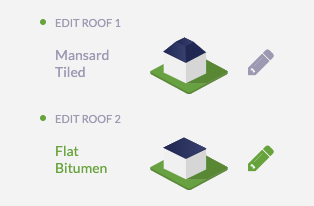
You can change the default flat roof (Roof 2 in the previous image) created on top of the mansard to other type of roof. The image below shows a mansard with a pent roof on top as an example:
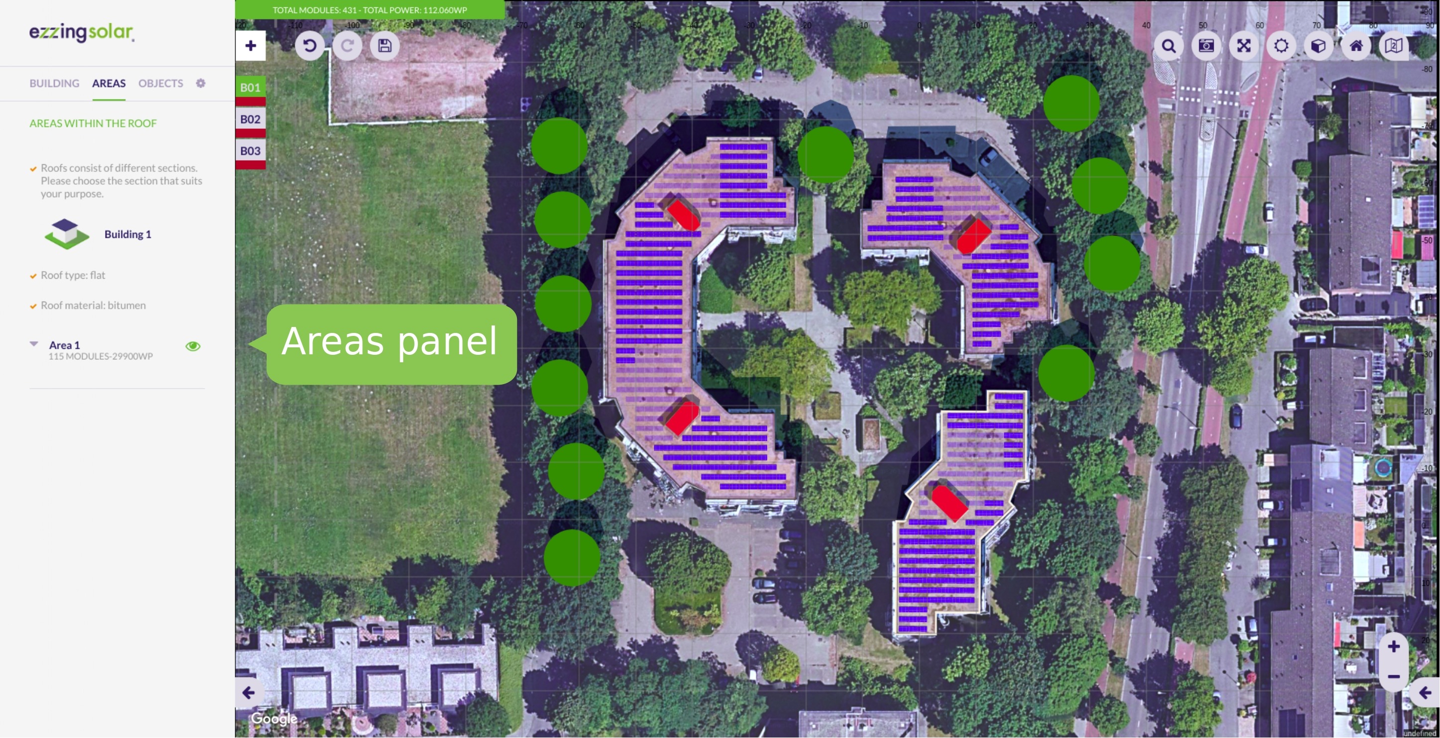
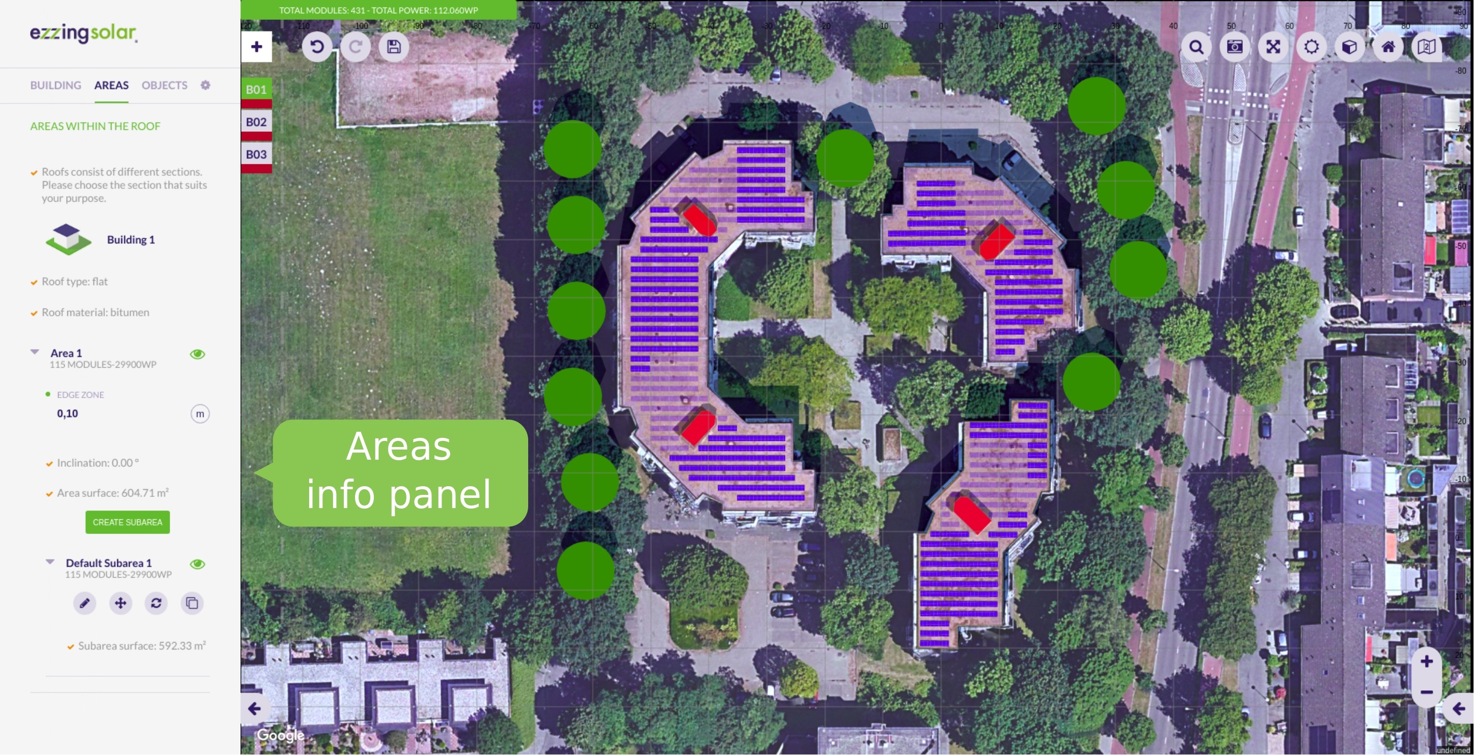
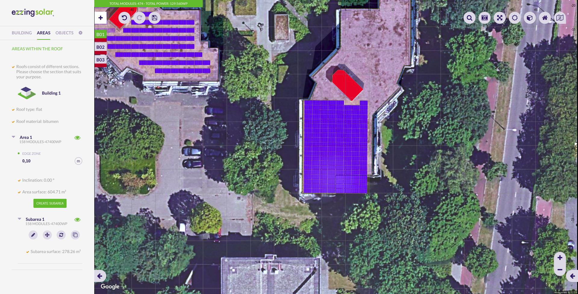
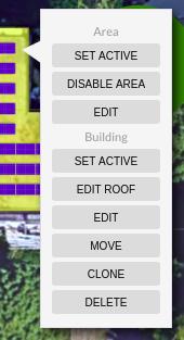
Areas
The areas are sections on the roof that are automatically created when selecting the type of roof.
Each area is composed of at least one subarea and has the information of the number of modules it contains and the power that generates.
If you want to disable one area, you can click on the eye button next to its name. By doing this, its module count and power generated will be set to 0.
Edit area
To edit an area you can modify the edge zone value. It is a numeric value that specifies the distance between the building limits and the subareas that exist within that area.
Subareas
A subarea is a region inside an area that allows you to define a modules installation just in a section of the area.
By clicking on a subarea, two views will appear: the project view (top) and the subarea view (bottom).
The subarea view is hidden by default. To toggle its view, you have to click on the button ‘Open subarea view’ or ‘Close subarea view’ at the bottom of the canvas.
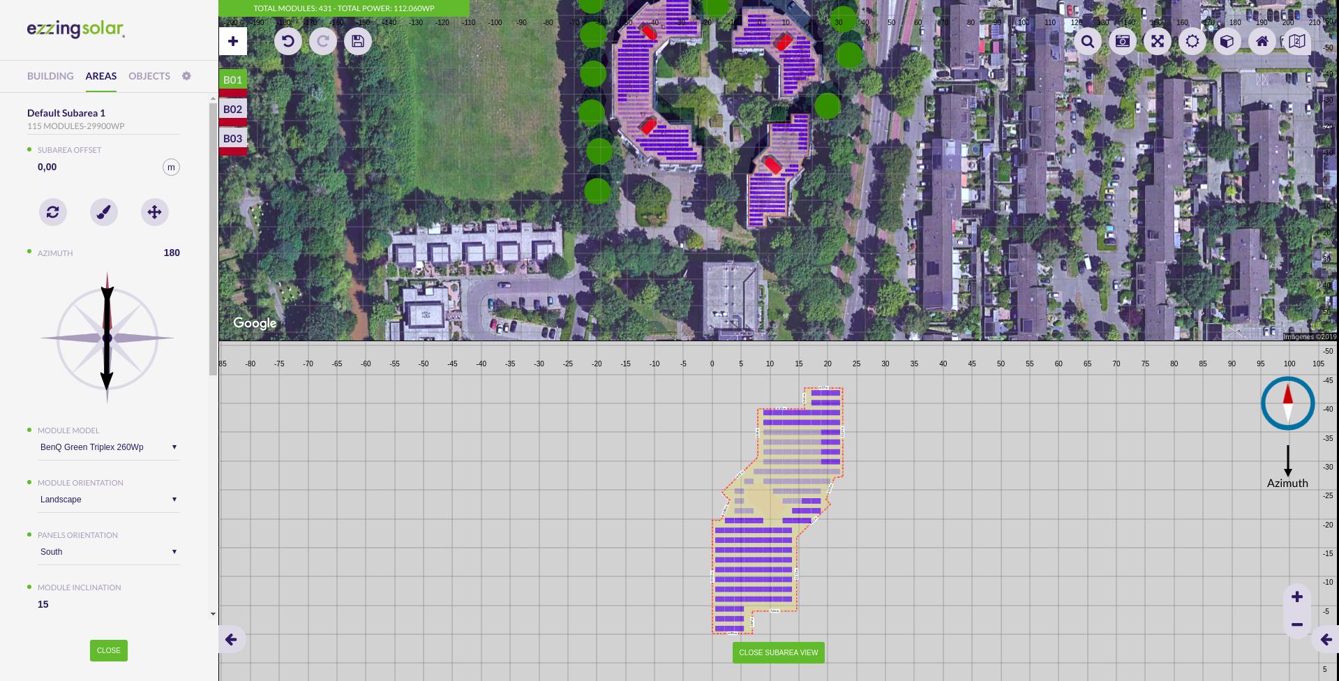
Note that when moving the subarea or changing its azimuth the subarea view will be opened. This is because this view hasn’t got any deformation.
Subarea creation
To create a subarea click on the ‘Create subarea’ button.
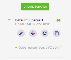
Once the subarea is created, you will be able to:
- Edit
- Move
- Refresh
- Remove (only if the area has more than one subarea)
- Clone (it will be cloned with the same settings)
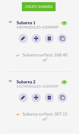
If you want to disable one subarea, you can click on the eye button next to its name. By doing this, its module count and power generated will be set to 0.
Add subarea
By clicking the ‘Create subarea’ button you enter in the subarea creation process.
If you create the first subarea it will replace the default one.
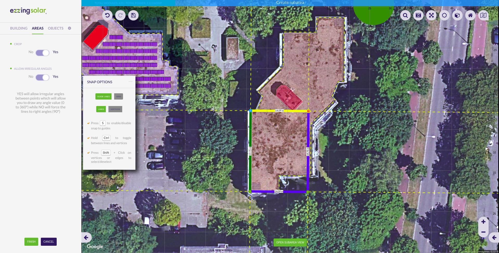
Crop subarea to the area shape
When editing the vertices of a subarea you can check the ‘Crop’ option. This helps you to draw subareas that extends to the border of the building with more precision.
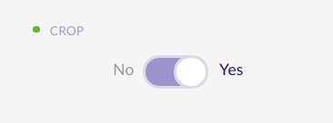
If you uncheck this option then the subarea can extend outside the area, following the area plane.
Edit subarea vertices
By clicking this button you can modify subarea vertices and the subarea will be recalculated.
Edit subarea
By clicking on a subarea you enter in the subarea edition process.
You will be able to refresh, paint or move all the modules.
These are all the subarea edition options:
- Module model: there are different module models available that have different size, weight and watt peak capacity
- Module orientation: you can choose between ‘landscape’ and ‘portrait’
- Panels orientation: you can choose between ‘south’ and ‘east/west’
- Module inclination
- Distance between modules
- Distance between rows
- Distance between centers
- Use max. shadow calculation: calculates the distance between rows and centers depending on the module inclination
- Azimuth: modules rotation
- Staggered enabled
- Sails
- Dilatation lines
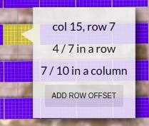
Here, you can click on any module to enable/disable it. If you right click on a module it will be displayed its position (row and column).
Remove subarea
By clicking this button you can remove a single subarea from the subareas list. It is only available if there exists more than one subarea.
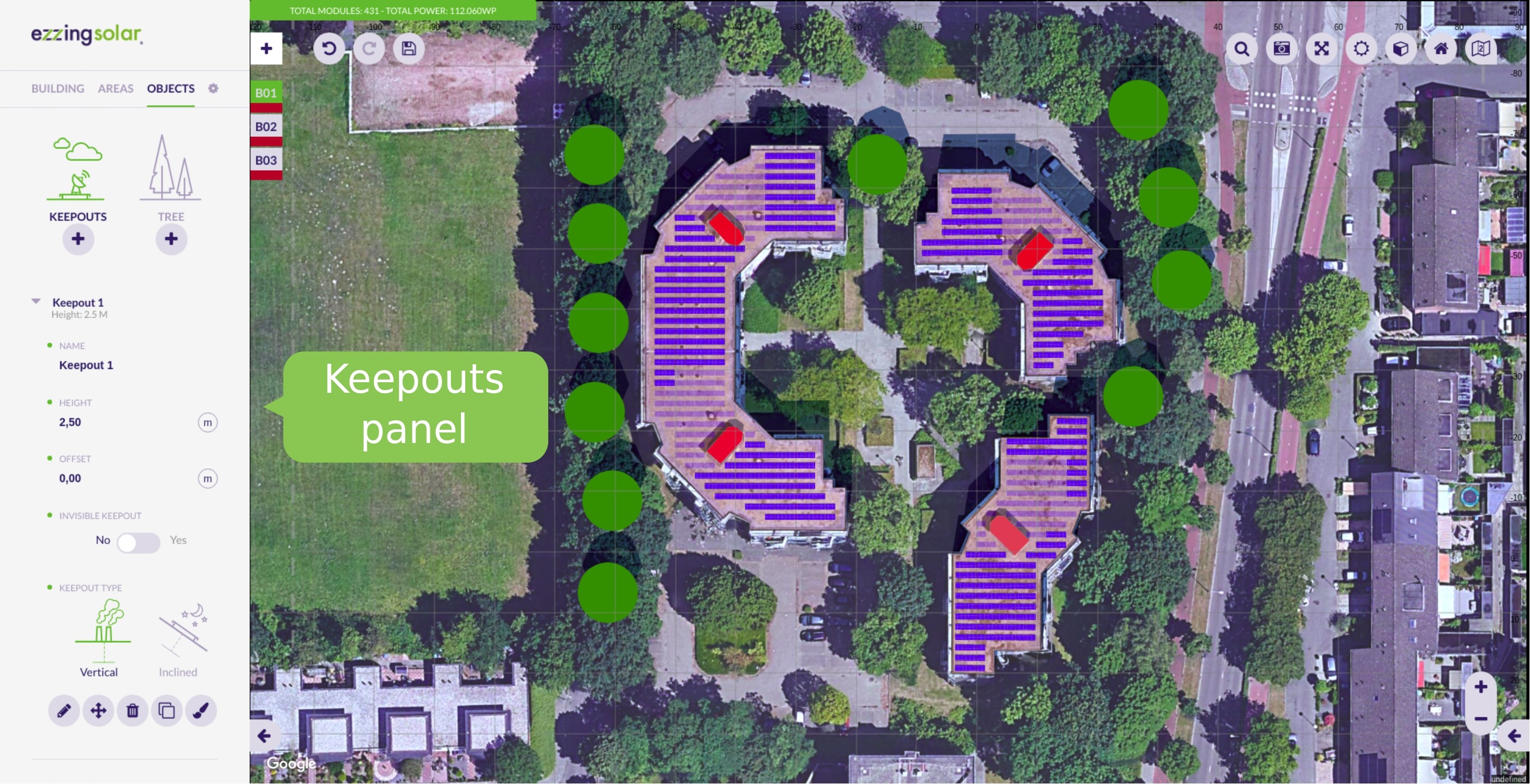
Keepouts
Keepouts are created for simulating any obstacle that might interrupt the installation of modules.
When a keepout is created, there can’t be any module that occupies the same position.
You can customize them by changing their height, offset and type (vertical or inclined).
Note that for flat roofs it is posible to create 0 height keepouts, but for inclinated roofs you need to use the invisible keepouts feature to allow keepouts at roof surface level.
Invisible keepouts
If you want to simulate a skylight or any keepout object without drawing the 3D volume you can check the ‘Invisible keepout’ option to hide the 3D volume but still taking the obstacle into account.

Crop keepout to the building shape
When editing the vertices of a keepout you can check the ‘Crop shape to building limits’ option. This helps you to draw keepouts that extends to the border of the building with more precision.
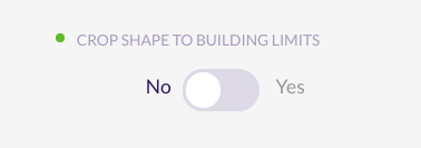
If you uncheck this option then the keepout can be floating outside the building limits. At least one vertex of the keepout should be inside the building limits to be created.
Vertical and inclined keepouts
You can create a keepout as vertical or inclined. If the keepout is inclined, it will be created starting from the inclination of the building.
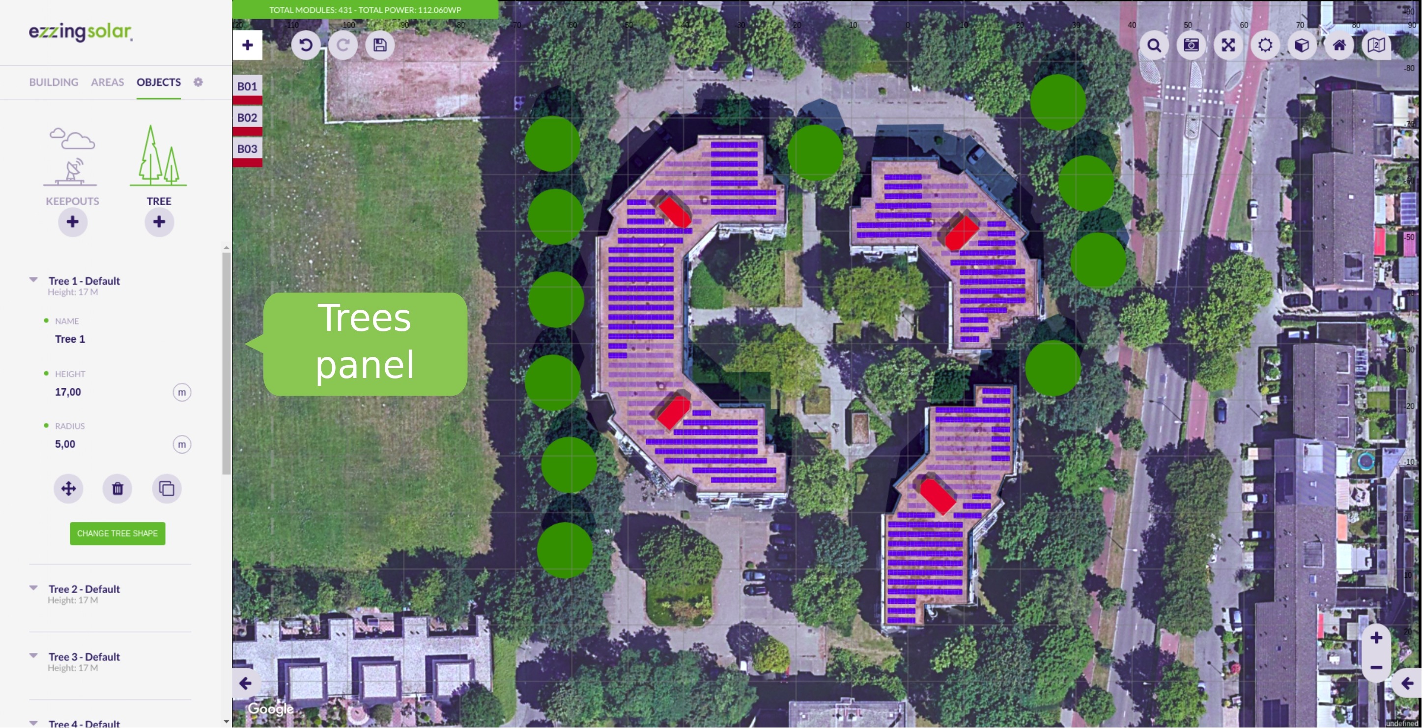
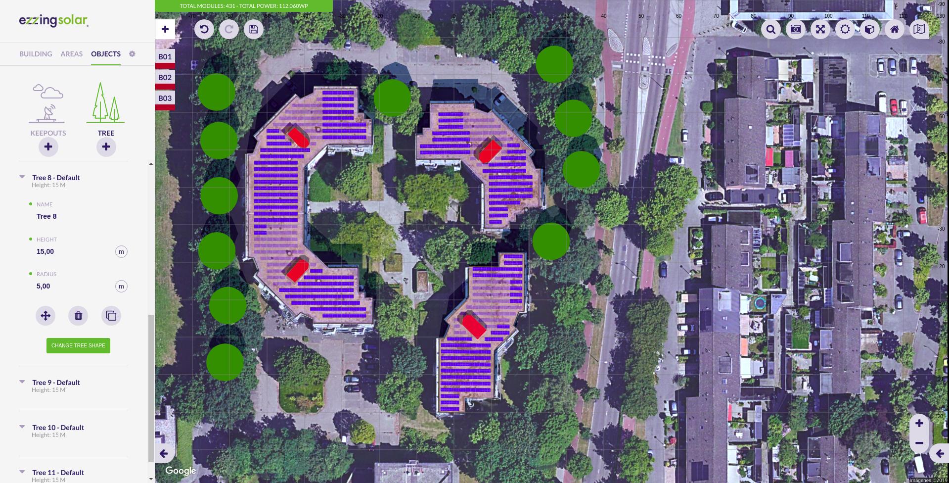
Trees
Trees belong to the scene, not to a building.
It is important to create trees for simulating the shadows on the roofs. Therefore, you will be able to move them and modify their height and radius. The shape of the tree is calculated according to the proportion of these values.
Drawing with Snaps
The snap is a helpful tool for drawing buildings, subareas and keepouts.
There are three ways for drawing points: without snap, using guide lines or a grid.
Without Snap
You can draw unassisted disabling both snap options. With this option you can put a point anywhere.
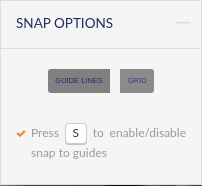
Guide lines
‘Guide lines’ is the default option when drawing. There are two ways for drawing points that can be combined to make the process easier: lines and vertices.
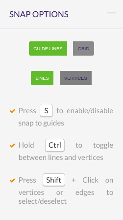
To use them, you need first to draw two points. Once you have drawn them, there will appear parallel and perpendicular guide lines to the last drawn point. This way you can create regular shapes with right angles (it is also possible to move points along these guide lines).
Switching to the ‘Vertices’ option allows you to draw points at the intersections of the guide lines and the vertices of the buildings.
Please, visit the section Context panel to see more drawing features.
Grid
When selecting this option appears a grid that occupies the entire canvas area.
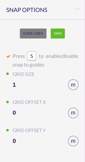
You can customize it by specifying a number for the grid size (size of each square) and an offset in the x and y coordinates for moving the grid.
Please, visit the section Context panel to see more drawing features.
Context panel
On a point
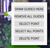
When right clicking a point, you can:
- Draw guides here (only in ‘Guide lines’ option): draws parallel and perpendicular guide lines to this point in relation to the selected edge
- Remove all guides (only in ‘Guide lines’ option): removes all guide lines except the ones to the selected point
- Select/deselect point: this is useful for moving many points along a guide line at once
- Deselect all points: deselects all points except the last selected one
- Delete point
On an edge
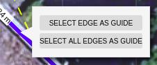
When right clicking an edge (only in ‘Guide lines’ option), you can:
- Select/deselect edge as guide: redraws the parallel and its perpendicular guide lines to the selected edge
- Select/deselect all edges as guide
On a module
By right clicking a module, it will display:
- The position of the module (column and row)
- Its index position in the row
- Its index position in the column
If dilatation lines are disabled, there are also two buttons to:
- Change row modules orientation
- Add row offset
On a keepout in subarea view
By right clicking on a keepout in the subarea view you can set that keepout as active, closing the subarea view.
On an object
You can also right click on any object in the svgProject. You will be able to set active, edit, move, etc the current object and its parents objects (ex: from a subarea you can execute areas and building operations).
Textures
The textures are images obtained from the satellite displayed on the roof, with the same size and position.
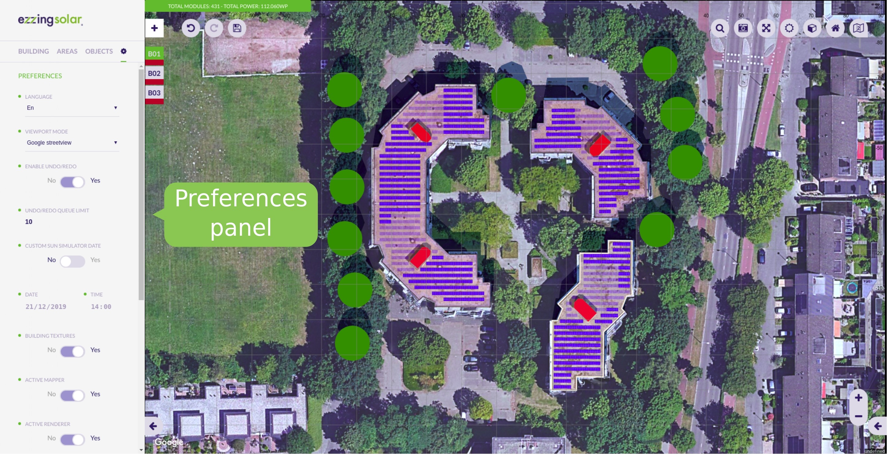
They are generated by default when a building is created. You can disable their automatic creation in the Preferences panel.
Please, visit the section Layout Rules to learn how to customize this property.
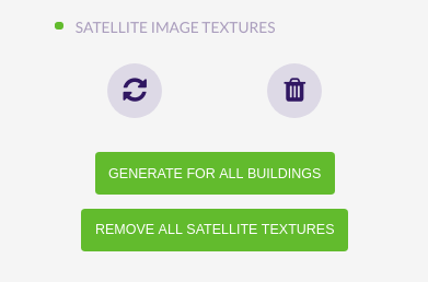
In the building panel you can see the different options for the satellite image textures:
- ’+’ : adds satellite texture for the active building
- Refresh (available when the active building has textures)
- Remove (available when the active building has textures)
- Generate for all buildings
- Remove all satellite textures
Note that the textures generation might fail because of the speed of the internet connection or the speed of response of the satellite image provider. For preventing the failure you can select each building and wait for the satellite images to load or refresh the textures individually.
Shortcuts
The shortcuts can be used in the following cases:
- To navigate between tabs, press 1, 2, 3 or 4
- To execute undo press ‘Ctrl + Z’, and to execute redo press ‘Ctrl + Y’
- When drawing:
- To enable/disable snap to guides, press ‘S’
- To toggle between guide lines and vertices you can hold ‘Ctrl’ / ‘⌘’
- To select/deselect vertices, click on them while pressing ‘Shift’
- Editing a subarea:
- Hold ‘Shift’ for selecting the hole row
- Hold ‘Ctrl’ / ‘⌘’ for selecting the hole column
- Moving a building, subarea or keepout:
-
Down: Numpad 1, 2, 3 ‘End’ ‘Down arrow’ ‘Page down’ -
Left: Numpad 1, 4, 7 ‘End’ ‘Left arrow’ ‘Home’ -
Right: Numpad 3, 6, 9 ‘Page down’ ‘Right arrow’ ‘Page up’ -
Center: Numpad 5 ‘Clear’
-
- Save: for saving the project in crm you can press ‘Ctrl + Shift + S’ / ‘⌘ + Shift + S’
- Widgets:
- To cancel the operation or close the widget, press ‘Esc’
- To confirm the operation, press ‘Enter’
Anyways, these shortcuts will be displayed on a widget, so you can consult them when necessary.
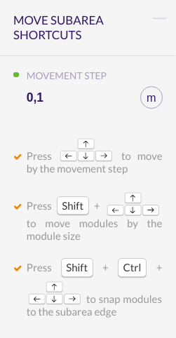
For users with Mac operating system, Ctrl key in shortcuts will be disabled using the Command key instead (⌘).
Progress bar
Everytime a long operation is being executed, it will be displayed a progress bar to inform the user.
The progress bar it’s composed of:
- Title: name of the operation being executed
- Label 1: function withing the operation
- Label 2: step of the funcion
- Bar: if there is a determinate number of steps it will be increasing its value, if not, it will be shown as an animation
- Cancel button: only visible on ‘Waiting for satellite tiles’ generating textures step
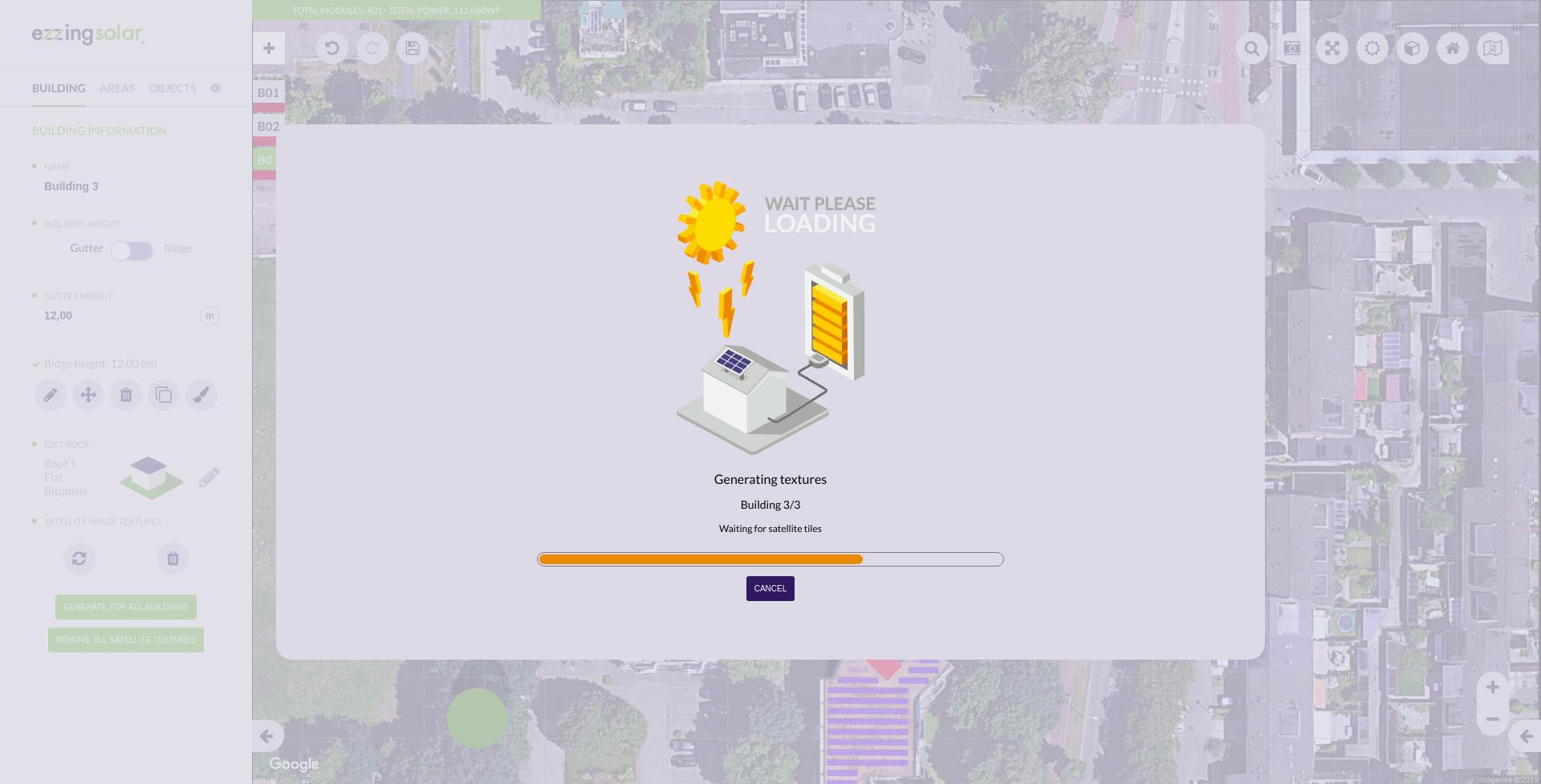
Please, visit the section Progress bar customization to learn how to customize the progress bar.
Layout Coordinate Systems
The 3DLayout works in four different coordinate systems, depending on which context we are requesting info.
World Coordinate System
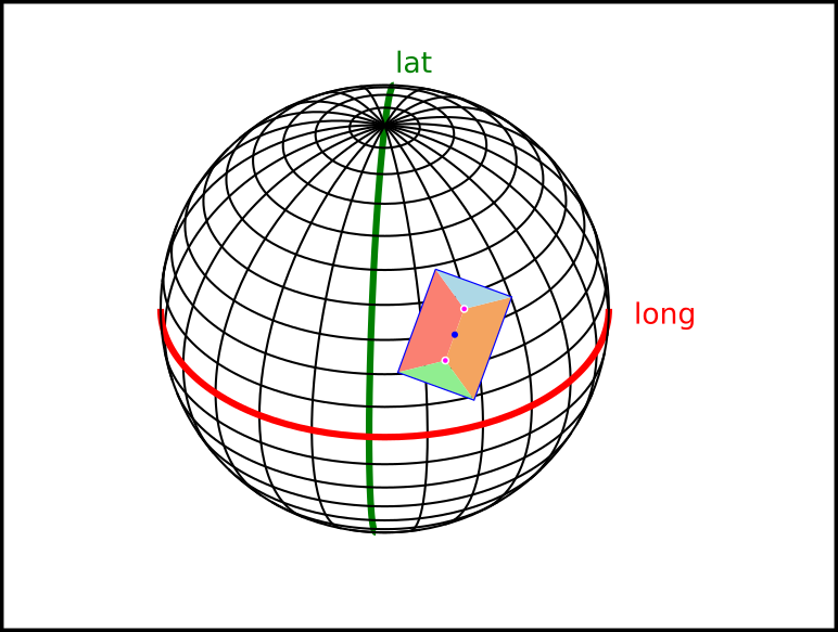
World coordinate system works with spherical coordinates, latitude and longitude.
The values stored in this system and the API calls to retrieve this data are:
- Layout project center > getLayout
Scene Coordinate System
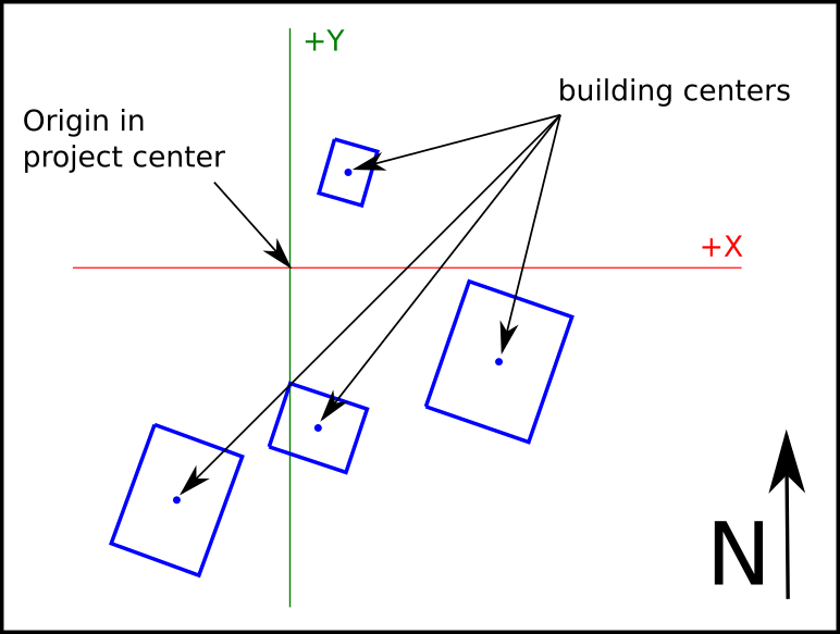
Scene coordinate system works with cartesian coords, with origin in the layout project center and distances measured in meters. It is used to place each building relative to the project center.
The values stored in this system and the API calls to retrieve this data are:
- Building data center > getBuildingInfo()
Building Coordinate System
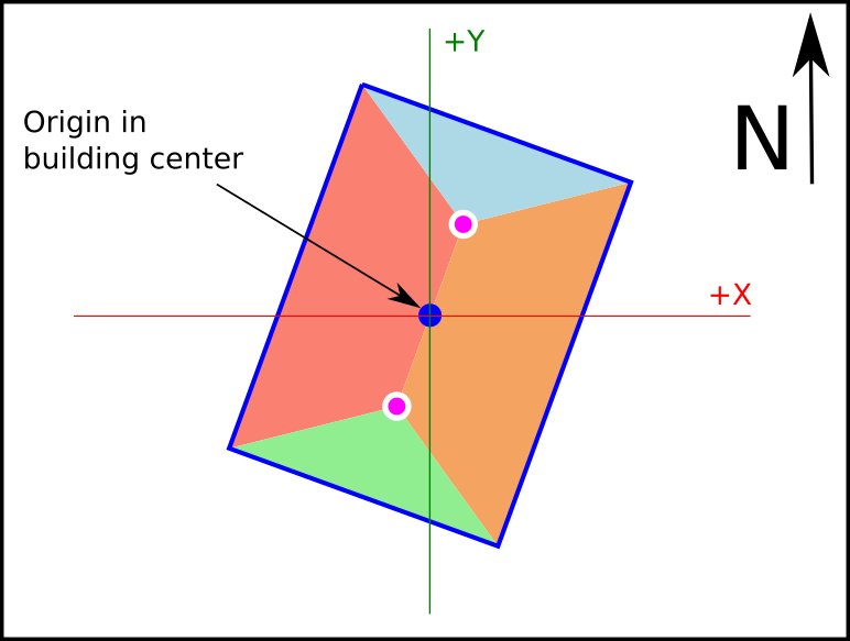
Building coordinate System works with cartesian coords, with origin in the building center and measured in meters. Al tilted surfaces are represented in ortographic view.
The values stored in this system and the API calls to retrieve this data are:
- Building vertices (verticesMCoords) > getBuildingInfo()
Area Coordinate System
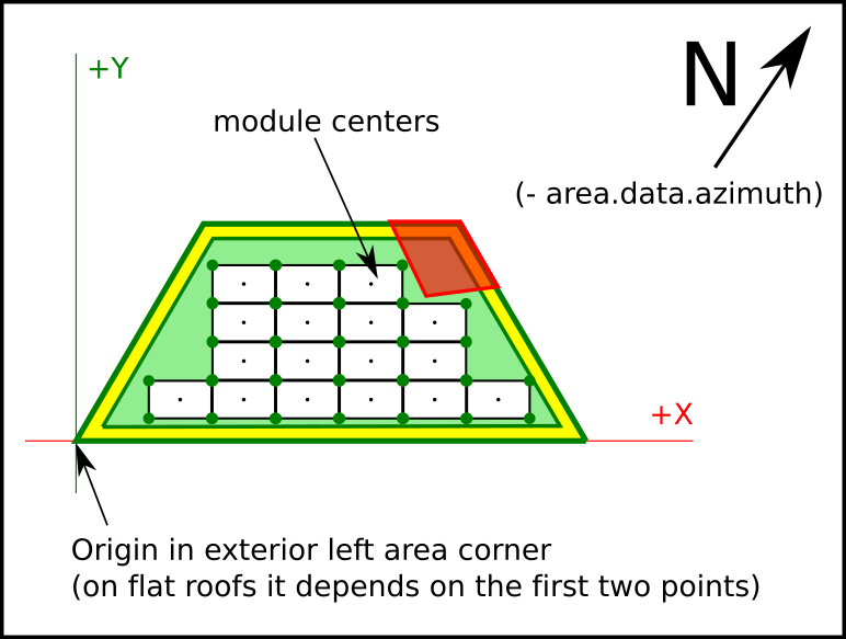
Area Coordinate System works in cartesian coords, with origin in the bottom-left corner of the area, and rotated with the exterior wall azimuth of the area. On flat roofs the first wall drawed is considered the main wall.
The values stored in this system and the API calls to retrieve this data are:
- Area vertices (verticesMCoords) > getAreaInfo()
- Area offset vertices (verticesOffsetMCoords) > getAreaInfo()
- Area modules coords (modulesData (x/y)) > getAreaInfo()
This is the same for subareas, just using getSubareaInfo
How to use
API key and autentication
The 3DLayout allows you to provide Google and Bing API keys.
In case these API keys don’t exist, the default provider will be Open Street Maps.
To add them as layout rules, please visit the Scene preferences section within the Layout Rules section.
DOM element
You need an element in the body of your html page, a div where the 3DLayout will fit inside this element.
This div can’t be bigger than the view size, and no scroll has to be applied to the html page.
You should not change the ezzing3d element size (width or height) but change the size of this container div.
<div style='height:100vh; width: 100vw'>
    <ezzing3d id='ezzing3d'></ezzing3d>
</div>
Basic functions
Adding the client.min.js script with a valid API key makes available
the Ezzing3DClient global object, which we will use to start using the
3DLayout.
The Ezzing3DClient object has the following functions:
- getLayout
- createLayout
- listLayouts
- loadLayout
- destroyLayout
getLayout
Returns the information of a layout related to the given id.
Ezzing3DClient.getLayout(layoutId, function(err, layoutData, container) {
    if (err) throw err;
    console.log(layoutData);
});
createLayout
Creates a new layout with the specified information.
var data = {
    title: "EzzingSolar",
    latitude: 40.428121,
    longitude: -3.698695,
    address: "Calle de Sagasta, 18",
    zip: "28004",
    city: "Madrid",
    province: "Madrid",
    country: "Spain"
};
Where the only required values are latitude and longitude.
Ezzing3DClient.createLayout(data, function(err, layoutData) {
    if (err) throw err;
    console.log(layoutData);
});
This will return the information from the created layout with the following properties:
{
  id: 1093,
  title: "EzzingSolar",
  address: "Calle de Sagasta, 18",
  zip: "28004",
  city: "Madrid",
  province: "Madrid",
  country: "Spain",
  latitude: "40.428121",
  longitude: "-3.698695",
  created_at: "2016-08-18T17:15:15+0000",
  updated_at: "2016-08-19T10:14:34+0000",
  url: "https://layout.ezzing.com/#/GXXlgzDk0rPsrdxWfDsE5Cdi9FwUrBPx7GfuxSf0::1093"
}
where:
{
  id: layout id needed for loading the project or retrieving information,
  title: a title for the project,
  address: project address,
  zip: zip code,
  city: city name,
  province: province name,
  country: country name,
  latitude: latitude value in decimal degrees (remember to include the negative sign for south and west coordinates),
  longitude: longitude value in decimal degrees (remember to include the negative sign for south and west coordinates),
  created_at: creation date (ISO8601),
  updated_at: creation date (ISO8601),
  url: an url to visit the project or embed it as an iframe
}
The url can be used to embed a readonly version of the project. You can read a description of this methods in the Showcase mode section.
listLayouts
Returns a list of all your created layouts.
Ezzing3DClient.listLayouts(function(err, layoutData) {
    if (err) throw err;
    console.log(layoutData);
});
loadLayout
Sets up the 3DLayout interface into the ezzing3D container and loads the project related to the given id.
var rules = {};

Ezzing3DClient.loadLayout(layoutId, rules, function(err, layoutApi, container) {
    if (err) throw err;
});
loadLayout can receive an options argument where you can setup some
customizations.
You can read a description of this methods in the Layout Rules section.
This method returns the following objects:
- layout: Exposes an object with methods to interact with the 3DLayout.
You can read a description of this methods in the 3DLayout Communication System section.
- container: the DOM element where the 3DLayout is created.
Showcase mode
If you want to show the layout to a customer or embed it in read-only mode in another page of your platform (to act as a thumbnail of the project) you can do it by adding an iframe element to an html page, with a modified version of the url of the layout.
It can be displayed with and without camera spin.
Showcase without camera spin
<iframe src=(url + "/showcase")> </iframe>
In this mode the 3DLayout will show the project in perspective mode without any gui elements and a quiet 3d view. You can click and drag with the mouse to rotate the view and zoom with the mouse wheel.
Showcase with camera spin
<iframe src=(url + "/spin-showcase")> </iframe>
In this mode the 3DLayout will show the project in perspective mode without any gui elements and a rotating 3d view. You can click and drag with the mouse to rotate the view and zoom with the mouse wheel. Once clicked the rotation will stop.
3DLayout Communication System
Info Events sent by 3DLayout
The 3DLayout triggers different events to report actions when they are accomplished or to inform on GUI changes.
Here is an example of how to listen to these events:
var container = window.document.getElementById('ezzing3d');

container.addEventListener('buildingSelected', function(event, data){
    console.log(event.detail);
});
The full list of events emmited by the 3DLayout are:
Active changed: triggered every time the user activates this object or enters its edit section. The event sends the object.id.
- Building: activeBuilding, editBuilding
- Area: activeArea, editArea
- Subarea: activeSubarea, editSubarea, resetSubarea
- Tree: activeTree, editTree
- Keepout: activeKeepout, editKeepout
Finish creation: triggered every time a one of the following objects is created. The event sends the object.id.
- buildingCreated
- subareaCreated
- keepoutCreated
Edit points: triggered every time the user enters the vertices/roof edit section of a building. The event sends the building.id).
- editVertices
- editRoof
- editRoofFinished
Close panel:
- editSubareaFinished
Set attribute changed: triggered every time any of these objects attribute is changed. The event sends back an array with [object.id, attribute, value].
- buildingChanged
- areaChanged
- subareaChanged
- treeChanged
- keepoutChanged
- roofChanged
- sceneChanged
Delete object: triggered every time any of these objects is deleted. The event sends the object.id (after this operation this object won’t longer exist in the project).
- buildingRemoved
- areaRemoved
- subareaRemoved
- treeRemoved
- keepoutRemoved
Change tab: triggered every time the aside panel navigation tab changes. It sends a string with the current tab name (‘building’, ‘areas’, ‘keepouts’, ‘trees’, ‘keepout-info’ or ‘tree-info’).
- tabChangedApi
Save project:
- layoutProjectSaved
Clone:
- buildingCloned
- areaCloned
- subareaCloned
- treeCloned
- keepoutCloned
Move points:
- locationChanged
Edit subarea:
- editSubareaPath
Move subarea:
- subareaMoved
Move system finished:
- modulesMoved
Delete subarea:
- subareaRemoved
Fullscreen enabled/disabled: triggered when the user changes from normal view to fullscreen. It sends true when changing to fullscreen and false when disabling it mode.
- ez3d-fullscreen-disabled
- ez3d-fullscreen-enabled
Lock interface:
- lockInterface
Invalid offset:
- invalidOffset
Undo/Redo panels: triggered when a customProperty has been changed sending the panel name.
- changePanelOnUndoRedo
Undo/Redo executed: triggered every time a undo or redo operation has been executed.
- executedUndoRedo
Functions to retrieve info from 3DLayout
There is a set of functions to retrieve information from the 3DLayout.
For all these functions you can send a callback as an argument to be executed when data is retrieved.
General functions
- saveProject(callback)
- refreshViewport
Panels functions
- setCustomPanel(customPanelData, callback): creates a new panel
- setUnits(unitToChange, callback): set a new unit (m, cm, mm, …)
Buildings functions
Set of functions to retrieve buildings information from the layout. The callback argument is always needed.
getCurrentBuildingId(callback)
Returns the id of the current active building.
getLayoutData(callback)
Returns a JSON with an array of buildings:
{
    id: building id,
    name: building name,
    areas: {
        id: area id,
        name: area name,
        subareas: {
            id: subarea id,
            name: subarea name
        }
    }
}
getBuildingInfo(id, callback)
Returns all the building information for a given building.id:
{
    id: the building id,
    name: the building name,
    height: building height (in meters),
    regular: true if building angles are all equal to 90º, false otherwise.
    buildingArea: building area measure (in square meters),
    centerDeg: building center in World coordinate system,
    centerMCoords: building center in Scene coordinate system,
    vertices: building vertices in world coordinate system  [DEPRECATED],
    verticesMCoords: building vertices in building coordinate system,
    modules: total of modules in the building
    power: total power of the building,
    areas: {
        id: the area id,
        name: the area name,
        subareas: {
            id: the subarea id,
            name: the subarea name
        }
    }
}
getRoofsInfo(id, callback)
Returns roof information for a given building.id:
{
    height: roof height (in meters, not including building height),
    inclination: roof angle (in degrees),
    material: roof material (i.e: tiled/corugated),
    orientation: roof orientation (i.e: east/west or nort/south),
    type: roof type (i.e: flat, pent, gabled, etc...)
}
getBuildingPosition(id, callback)
Returns building position info for a given building.id:
{
    center: building center in world coord system [DEPRECATED],
    vertices: array of building vertices, world coord system [DEPRECATED],
    centerDeg: building center in World coord system,
    centerMCoords: building center in Scene coord system,
    verticesMCoords: building vertices in building coord system,
}
getNumberOfModules(callback)
Returns a JSON with an array of buildings with the following properties:
{
    id: building id,
    name: building name,
    modules: total of modules in the building,
    areas: {
        id: area id,
        name: area name,
        modules: total of modules in the area,
        subareas: {
            id: subarea id,
            name: subarea name,
            modules: total of modules in the subarea
        }
    }
}
getTotalPower(callback)
Returns the total power for all the buildings in the project.
getPower(callback)
Returns an array of all buildings in the project with the following properties:
{
    id: the building id,
    name: the building name,
    power: the total power for this building,
    areas: {
        id: the area id,
        name: the area name,
        power: total power in this area,
        subareas: {
            id: the subarea id,
            name: the subarea name,
            power: total power in this subarea
        }
    }
}
Areas functions
Set of generic functions to retrieve Area related information from the layout. In this set of functions you should pass an existing area id and a callback.
- getAreaInfo
- getAreaOffset
getAreaInfo(id, callback)
Returns area info for a given area.id:
{
    id: area id,
    name: area name,
    offset: area offset,
    placement: placement (ex: portrait/landscape),
    structure: (ex: east-west/standard),
    inclination: modules inclination (in degrees),
    azimuth: modules azimuth inclination (in degrees),
    areaMCoords: array with area vertices coordinates in Area system coords [DEPRECATED],
    areaOffsetMCoords: array with offseted area vertices in Area system coords [DEPRECATED],
    verticesMCoords: array with area vertices coordinates in Area system coords,
    verticesOffsetMCoords: array with offseted area vertices in Area system coords,
    wallSizes: size in meters for each area wall,
    wallAzimuth: azimuthal angle for the external area wall,
    power: total power of the area,
    subareas: {
        id: subarea id,
        name: subarea name
    }
}
getAreaOffset(id, offset, callback)
Returns an array of vertices containing the offseted area for a given area.id and offset.
If the offset is a negative value, then the area is reduced by the offset value (in meters).
Subarea functions
Set of generic functions to retrieve area related information from the layout. In this set of functions you should pass an existing area id and a callback.
- getSubareaInfo
- getModuleInfoBySubarea
- getModulesStructureBySubarea
getSubareaInfo(id, callback)
Returns subarea info for a given subarea.id:
{
    id: subarea id,
    name: subarea name,
    offset: subarea offset,
    placement: placement (ex: portrait/landscape),
    structure: (ex: east-west/standard),
    inclination: modules inclination (in degrees),
    azimuth: modules azimuth inclination (in degrees),
    verticesMCoords: array with subarea vertices coordinates in Area system coords,
    verticesOffsetMCoords: array with offseted subarea vertices in Area system coords,
    wallSizes: size in meters for each subarea wall,
    wallAzimuth: azimuthal angle for the external area wall,
    power: total power of the subarea,
}
getModuleInfoBySubarea(id, callback)
Returns module info for a given subarea.id:
{
    id: module id,
    name: module model name,
    reference: extra model information,
    width: width of the module (in meters),
    height: height of the module (in meters),
    length: lenght of the module (in meters),
    power: power of the module
}
getModulesStructureBySubarea(id, callback)
Returns a JSON with an array of modules for a given subarea.id:
{
    x: x position of the module in Area system coords,
    y: y position of the module in Area system coords,
    col: column to which the module belongs,
    row: row to which the module belongs,,
    rX: rotation of the module in the X axis (inclination),
    rZ: rotation of the module in the Z axis (azimuth),
    color: color of the module (only exist if color is not default),
}
Functions to send info to the 3DLayout
Set of functions to change values inside the project:
- setAttribute(objectId, attr, value, callback)
- updateRender
- setActive(objectId, callback)
- disabledMap(callback)
- cleanResult(list)
Alert widgets
It is important to notify the user when a change is going to be made or an error has appeared. You can create new customizable widgets on any panel element when its value is going to be changed.
To create a widget, you have to add two json properties on the json of the element whose value is being modified: ‘confirmation’ and ‘confirmationWidget’.
paint: {
    type: 'button',
    tooltip: 'paint',
    classed: 'ez3d-button fa-paint-brush',
    confirmation: true,
    confirmationWidget: {
        'name': 'color-palette-selector-building',
        'title': 'colorPaletteSelector',
        'functionOnCreation': ['colorPaletteWidget', 'building']
        'eventCancel': ['close_widget_notification', ''],
    }
}
The ‘confirmation’ property is a boolean that determines if the widget will be shown or not. It can be a raw value (true/false) or a function that returns a boolean value.
The ‘confirmationWidget’ property is an object composed of:
confirmationWidget: {
    'name': widget id,
    'title': title displayed on the header,
    'content': string with the content of the widget
    'functionOnCreation': function with a json of the elements to create in the widget content container
    'eventOk': [optional] the changes will be applied
    'eventCancel': [optional] the changed value won't be applied and the panels will update
}
If the widget is going to be only informative, there must be an ‘eventOk’ property so that the changes are applied.
Notice that both ‘content’ and ‘functionOnCreation’ properties create the content of the widget but in different ways, therefore you can only use one of these.
Progress bar customization
The progress bar is managed by events:
- showProgressBar
- resetProgressBar
- updateProgressBar
- hideProgressBar
- Cancel button events
Show progress bar
This event shows an empty progress bar. It must be emitted if the changes on the progress bar want to be displayed.
ee.emitEvent('showProgressBar');
Reset progress bar
Resetting the progress bar will remove its width and set the bar animation. We recommend you to emit this event before updating the progress bar with a value.
ee.emitEvent('resetProgressBar');
Update progress bar
To update the progress bar it is important to first open it by emitting the event ‘showProgressBar’. The values will be sent as an object this way:
ee.emitEvent('updateProgressBar', [{
    title: 'Title of the operation',
    label1: 'Name of function',
    label2 : 'Step withing the function',
    value: 50
}]);
There are some cases that need to be mentioned when sending these parameters:
- If ‘title’ is undefined, it will keep its last value. If it’s different than the current one, the progress bar will reset
- If ‘label1’ is undefined, it will keep its last value. If title has changed, it won’t have a value
- If ‘label2’ is undefined it won’t have a value
- If ‘value’ is undefined it will be displayed the animation in the bar. Otherwise, it’s value will be added to the width of the bar.
The simplest example is generating all the textures. If the project has 3 bulidings, you will have to divide 100 by number of buildings, so that the bar width will increase a 33.3% each time the event is emitted.
Hide progress bar
When the progress bar is being hidden, all of its texts are removed, the animation is shown and the cancel button is hidden.
ee.emitEvent('hideProgressBar');
Cancel button events
The cancel button is hidden by default. You can display it by sending a boolean parameter on the emitted event.
Keep in mind that this event has to be emitted before executing an operator or within it. Also, there has to be a listener ‘cancelProgressBar’ that is going to be executed when clicking on this button.
ee.emitEvent('showProgressBarCancelBtn', [boolean]);
In the case of texture generation, these events are emitted in the operator.
There is also a listener to update this button used when changing language. This removes and recreates the button with the hidden visibility property.
ee.emitEvent('updateProgressBarCancelBtn');
Custom panels
You can customize all of the panels by changing their content.
There is a function in the API called setCustomPanel that receives as parameter a json that contains the panel info, content, functions and listeners.
To create a new panel, the panel elements must be in a ‘json’ property and a ‘populate’ property must be valued with ‘updatePanel’.
var newPanel = {
    name: 'panel-name',
    model: 'EZModelKeepout',
    customMethods: {},
    customGuiMethods: {},
    customListeners: {},
    json: {
        name: {
            type: 'string',
            property: 'name',
            label: 'keepout_name',
            value: this.name
        }
    },
    populate: 'updatePanel'
}
To create a group of panels, they have to be declared as customMethods:
var keepoutPanels = {
    name: 'custom-keepouts-panels',
    model: 'EZModelKeepout',
    customMethods: {
        keepoutCreate: customKeepoutCreatePanel,
        keepoutEdit: customKeepoutEditPanel,
        keepoutInfo: customKeepoutInfoPanel
    },
    customGuiMethods: {}
};
These panels are also jsons that define the content of each panel by blocks.
Please, visit the section Panel blocks to learn how to create different blocks in panels.
CustomMethods are functions that extend the given model (for example, EZModelKeepout). For executing these, you have to use the runMethod operator in an eventOnClick/eventOnChange property:
eventOnChange: ['EZModelKeepout_runMethodListener', 'nameOfTheCustomMethod']
CustomGUIMethod will be executed directly in a functionOnClick/functionOnChange giving arguments as a second paramenter:
functionOnClick: ['nameOfTheGUIMethod', argument],
CustomListeners define which event are listening to, and which customGUIMethod will run:
nameOfProperty: ['eventToListen', 'nameOfTheGUIMethod']
Panel blocks
To create different blocks, each element must have a ‘type’ property. These are the available types:
- string
- float / integer
- boolean
- select
- selectByImage
- selectBySVGImage
- azimuthRange
- helper
- link
- groupBlock
- button
- listResume
- blockList
- foldableBlock
- subareaBlock
- blockResume
- title
- compass
- invisibleKeepout
- stringWidget
- selectWidget
- buttonsPanelWidget
- buttonWidget
- rangeWidget
- dateTimeWidget
- booleanWidget
- imageNavigator
- navigator
Layout Rules
The user can customize many options in the 3DLayout. By passing a ‘rules’ attribute to the 3DLayout instance with a collection of objects, you can define the default values, add special behaviours to the 3DLayout and customize the interface.
Example of rules object:
var rules = {
    'display': true,
    'zoom': 21,
    'logo': false,
    'CustomPalette': ['#ff0000', '#00ff00']
}
Available rule objects expected by the 3DLayout:
- Scene preferences
- Project
- Development
- 3D canvas
- Model
- GUI
- Default buttons
- Default languages
- Default colors
- Css colors
- Building and roof colors
- Keepout colors
- Area colors
- Dilatation lines colors
- Module colors
- Tree colors
- Custom colors
- Default modules
- Default providers
- Default model values
- Default model area values
- Default model building values
- Default model keepout values
- Default model roof by type values
- Default model roof values
- Default model subarea by roof type values
- Default model subarea values
- Default model tree values
Scene preferences
Project
The attributes are:
{
    defaultProjectId: crm project to load if there's no hash (set to 0 to load the demo version),
    loadMockup: if true it loads a mockup,
    userToken: user token
}
Development
All the attributes are boolean:
{
    debugPromises: debug promises (console log),
    enableUndoRedo: enable undo/redo feature,
    enableApi: enable Api feature,
    snapShotCrm: allow snapshots to be sent to crm,
    debugListeners: debug number of listeners in console.log,
    debugOpTime: shows the time an operation takes to be done,
    recordOperators: record all the executed operators with their args,
    debugContainers: show or ignore console.logs in code,
    showOldSystemProject: show old drawing in svgProject container,
    showNewSystemProject: show new drawing in svgProject container
}
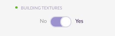
3D canvas
Sample values:
{
    activeMapper: true,
    activeRenderer: true,
    buildingTextures: true,
    zoomRatio: 1,
    translationRatio: 1,
    rotationRatio: 1,
    enablePlayer: true,
    customDateTime: false,
    defaultDateTime: '2019-01-01T10:00'
}
The attributes are:
{
    activeMapper: activate mapper on start,
    activeRenderer: activate renderer on start,
    buildingTextures: generate building textures when creating a building,
    zoomRatio: zoom ratio for 3D mode,
    translationRatio: translation ratio for 3D mode,
    rotationRatio: rotation ratio for 3D mode,
    enablePlayer: enable three.js canvas,
    customDateTime: enable custom date time for sun simulation,
    defaultDateTime: date time for sun simulation (customDateTime must be true, or defaultDateTime will be calculated depending on hemisphere)
}
Model
Sample values:
{
    collisionBias: 0.03,
    angleBias: 0.5,
    maxAreaInclination: 75,
    sunSpeed: 3,
    googleApiKey: '',
    bingApiKey: '',
    maxDistanceFromCenter: 1000
    includeInsetInDL: false,
    limitUndoRedo: 10
}
The attributes are:
{
    collisionBias: factor to validate collisions (with bigger values less collision),
    angleBias: factor to validate regular angles (with bigger values less angle precision),
    maxAreaInclination: area is disabled when the area inclination is bigger than this value,
    sunSpeed: position of element of the sun simulator speed,
    googleApiKey: Google api key for provider,
    bingApiKey: Bing api key for provider,
    maxDistanceFromCenter: max distance in meters allowed from the first drawn building vertex to the project center
    includeInsetInDL: include inset in DL height and width,
    limitUndoRedo: maximum number of operations stored in the undo/redo history
}
GUI
Sample values:
{
    closeRightCanvas: true,
    showCoordinates: false,
    showTotalPower: true,
    customLogoUrl: 'default',
    showNav: true,
    showLogo: true,
    defaultLanguage: 'en',
    defaultUnits: 'm',
    enableNotifications: true,
    manageFullscreen: true,
    movementStep: 0.1,
    snapToGrid: false,
    gridSize: 1,
    gridOffsetX: 0,
    gridOffsetY: 0,
    snapToGuides: true,
    snapToLines: true,
    snapToVertices: false,
    maxAllowedBuildings: 0,
    viewportMode: 4,
    customRowOffset: true,
    customRowOrientation: false,
    slowInternetConexionTimeout: 40000,
    hidden: []
}
The attributes are:
{
    closeRightCanvas: close right canvas on start,
    showCoordinates: show coordinates of the mouse in the right bottom corner,
    showTotalPower: show 'Total power' indicator in the left upper corner,
    customLogoUrl: custom logo url,
    showNav: show or hide nav,
    showLogo: show logo,
    defaultLanguage: string from available keys at 'defaultLanguages',
    defaultUnits: string from available keys at 'units',
    enableNotifications: enable operator notifications feature,
    manageFullscreen: manage fullscreen mode,
    movementStep: amount of movement in meters when using arrow keys to move solar panels,
    snapToGrid: enable snap vertices to grid,
    gridSize: grid distance to use as snap when using snap to move vertices,
    gridOffsetX: offset grid drawing in x axis,
    gridOffsetY: offset grid drawing in y axis,
    snapToGuides: activate snap to guides,
    snapToLines: enable snap to guidelines or edges,
    snapToVertices: enable snap to vertices or guideline intersections,
    maxAllowedBuildings: hides the button to create new buildings when their quantity is >= to this value (if it's 0 there is no max quantity),
    viewportMode: viewport mode,
    customRowOffset: enable custom row offset (right click on modules),
    customRowOrientation: enable custom row orientation (right click on modules),
    slowInternetConexionTimeout: timeout in milliseconds to display a widget to inform and cancel progress bar
    hidden: array of json properties within that json that don't want to be shown in panels
}
The viewportMode options are:
- 0: invisible interface
- 1: showcase mode
- 2: open street map
- 3: hide interface [DEPRECATED]
- 4: google streetview
- 5: default values editor
- 6: simple mode
- 7: documentation
- 8: autocad export
- 9: simple mode invisible
- 11: read only
Default buttons
There are several areas in the 3DLayout where the user can add his own functions. The defaultButtons property has different properties depending on the area of the buttons:
{
    buttonsPanelLeft: { },
    buttonsPanelRight: { },
    buttonsPanelBottomZoom: { },
    buttonsPanelBottomRight: { },
    buttonsPanelBottomLeft: { },
    buttonsPanelBottomCenter: { },
    buttonsPanelRightViewportRight: { }
}
Each buttons panel has the following properties:
buttonsPanelRight: {
    position: 'right',
    buttonsPanel: {
        type: 'groupBlock',
        elements: { }
    }
}
To create a button panel you must specify its type (‘groupBlock’).
The ‘elements’ property within ‘buttonsPanel’ contains all the buttons that exist in that button panel. For example, to create the ‘Snapshot’ and ‘Fullscreen’ buttons at the right-top of the canvas:
elements: {
    classed: 'ez3d-panel-buttons ez3d-flex-start-wrap-row viewport_left_controls_left',
    snapshot: {
        type: 'button',
        tooltip: 'snapshot',
        classed: 'ez3d-button fa-camera-retro',
        confirmation: true,
        confirmationWidget: {
            'name': 'snapshot',
            'title': 'snapShot',
            'functionOnCreation': ['managerWidgetSnapShot', 'snapshot']
        }
    },
    fullScreen: {
        type: 'button',
        tooltip: 'fullScreen',
        classed: 'ez3d-button ez3d-screen-icon',
        changeIcon: 'screen',
        functionOnClick: ['fullScreen', '']
    },
}
The ‘elements’ property is composed of a ‘classed’ property to position the buttons, and the buttons by their name.
All the properties that a button can have are:
buttonName: {
    type: 'button',
    id: button id,
    classed: class button attribute,
    content: button text,
    tooltip: button tooltip,
    property: attribute only model,
    confirmation: boolean for showing a button confirmation widget,
    confirmationWidget: {
        'eventOk': event sent when clicking on the 'Ok' button,
        'eventCancel': event sent when clicking on the 'Cancel' button,
        'name': widget id,
        'title': widget title,
        'content': widget content,
        'functionOnCreation': function called when creating the widget
    }
    value: button value,
    changeIcon: toggle button icon string,
    editable: disabled button attribute,
    active: active button class,
    elements: foldable elements list (object),
    functionOnClick: function called when clicking on the button,
    eventOnClick: event sent when clicking on the button
}
It is very important to specify the type of element (in this case ‘button’) for creating correctly these elements.
These buttons will be created following the order of the ‘buttonsPanel.elements’ object.
Default languages
To customize the existing languages or add new ones, you have to edit them or create a new json property with the name of that language abbreviation (‘EN’, ‘FR’, ‘ES’, etc).
var defaultLanguages = {
    'EN': {
        'key': 'english key value'
    },
    'FR': {
        'key': 'french key value'
    }
}
Default colors
All the customizable colors can be also edited in the Preferences menu selecting the ‘Default values editor’ on the viewport mode. These are:
var defaultColors = {
    cssColors: { },
    buildingColors: { },
    roofPointsColors: { },
    roofRidgeColors: { },
    keepoutColors: { },
    areaColors: { },
    subareaColors: { },
    dilatationLinesColors: { },
    moduleColors: { },
    treeColors: { },
    customColor: { }
}
Css colors
These colors are used in the viewport and buttons in the canvas areas.
cssColors: {
    first: '#7AAD37',
    second: '#222960',
    third: '#E68A14',
    lightgray: '#DDDCE6',
    mediumgray: '#A7A3BC',
    darkgray: '#999',
    disabledbuttons: '#808080',
    disabledCustomSwtch: '#e0dfe4',
    primaryFont: '#ff0000',
    white: '#ffffff',
}
Building and roof colors
Building and roof colors have the same main attributes:
{
    fill: '#a52a2a',
    fillOpacity: 0.1,
    stroke: '#000',
    strokeWidth: 0.4,
    strokeDasharray: 0
}
These attributes can belong to different properties. For example ‘standard’, ‘hover’, ‘active’, ‘vertices’, etc.
Note that every time it appears an empty object ({ }) in the examples, these main attributes exist in them.
buildingColors: {
    path: {
        standard: {
            fill: '#a52a2a',
            fillOpacity: 0.1,
            stroke: '#000',
            strokeWidth: 0.4,
            strokeDasharray: 0
        },
        hover: { },
        active: { },
        roofContext: { },
        move: { }
    },
    vertices: {
        standard: { }
    },
    center: { },
    autocad: { }
}
Also, in ‘roofPointsColors’ and ‘roofRidgeColors’ properties there’s a new property called ‘radius’ on each property.
roofPointsColors: {
    standard: {
        fill: '#008000',
        fillOpacity: 1,
        stroke: '#fff',
        strokeWidth: 0,
        strokeDasharray: 0,
        radius: 3
    },
    locked: { }
},
roofRidgeColors: {
    path: {
        standard: { }
    }
}
Keepout colors
In keepout colors property there are two new properties called ‘offsettedPath’ and ‘autocad’:
keepoutColors: {
    path: {
        standard: { },
        active: { },
        hover: { },
        move: { },
        offsettedPath: { }
    },
    autocad: { }
Area colors
Areas and subareas have the same properties except for ‘autocad’ property, which is only available in areaColors.
areaColors: {
    path: {
        standard: { },
        active: { },
        move: { },
        hover: { },
        offsettedPath: { },
        roofEditor: { },
        hoverRoofEditor: { }
    },
    vertices: {
        standard: { },
        move: { }
    },
    autocad: {
        fill: 'transparent',
        fillOpacity: 1,
        stroke: '#ff3047',
        strokeWidth: 0.3,
        strokeDasharray: 0,
        strokeLine: '#6fff6d',
        strokeWidthLine: 0.02
    }
},
Dilatation lines colors
Sample values:
dilatationLinesColors: {
    cols: {
        stroke: '#ffa500'
    },
    rows: {
        stroke: '#00ffff'
    }
}
Module colors
Properties for module colors:
moduleColors: {
    path: {
        module: { },
        moduleSelected: { },
        moduleHover: { },
        empty: { },
        emptyHover: { },
        collision: { }
    },
    autocad: { }
},
Tree colors
Properties for tree colors:
treeColors: {
    standard: { },
    active: { },
    hover: { },
    move: { }
}
Custom colors
Sample values:
customColor: [
    '#0000FF', '#a52a2a', '#ff0000', '#1f77b4', '#aec7e8', '#ff7f0e',
    '#ffbb78', '#2ca02c', '#98df8a', '#d62728', '#ff9896', '#9467bd',
    '#c5b0d5', '#8c564b', '#c49c94', '#e377c2', '#f7b6d2', '#7f7f7f',
    '#c7c7c7', '#bcbd22', '#dbdb8d', '#17becf', '#9edae5'
]
Default modules
The defaultModules variable is an array of objects with the modules information:
var defaultModules = [
    {
        id: 47113,
        name: 'BenQ',
        reference: '327Wp Mono Zwart',
        power: 327,
        length: 1.559,
        width: 1.046,
        height: 0.046
    }
Default providers
The defaultProviders variable is an array of strings with the providers names:
var defaultProviders = ['White Map', 'Google Hybrid', 'Bing', 'Carto', 'Open Street Maps'];
Default model values
The defaultModelValues property is an object with the following properties:
var defaultModelValues = {
    area: areaDefaultValues,
    building: buildingDefaultValues,
    keepout: keepoutDefaultValues,
    roofByType: roofByTypeDefaultValues,
    roof: roofDefaultValues,
    subareaByRoofType: subareaByRoofTypeDefaultValues,
    subarea: subareaDefaultValues,
    tree: treeDefaultValues
}
Default model area values
Sample values:
var areaDefaultValues = {
    disabled: false,
    populated: true
}
Default model building values
Sample values:
var buildingDefaultValues = {
    overlapping: true,
    name: ' ',
    height: 10,
    maxHeight: Infinity,
    minHeight: 0,
    offset: [0],
    padding: {
        eaves: false,
        parapet: 0,
        height: 0
    },
    populated: true,
    regular: true,
    ridge: {
        enabled: false
    },
    hidden: [ ]
}
Default model keepout values
Sample values:
var keepoutDefaultValues = {
    crop: false,
    height: 1,
    invisible: false,
    offset: [0],
    regular: true,
    type: 'vertical',
    hidden: [ ]
}
Default model roof by type values
Sample values:
-
Adds new available materials to list: var roofByTypeDefaultValues = { flat: { material: ‘bitumen’, availableMaterial: { gravel: { value: ‘gravel’, image: ‘gravel’, label: ‘gravel’ }, bitumen: { }, membrane: { }, concrete: { } }, availableOrientation: [ ], inclination: 0, offset: [1], orientation: ‘’, hidden: [ ], locked: [ ] }, gabled: { }, hipped: { }, pyramid { }, mansard { }, }
-
Overwrites available materials with default values: var roofByTypeDefaultValues = { pent: { material: ‘tiled’, availableMaterial: [ ‘tiled’, ‘trapezoidal’, ‘corrugated’ ], offset: [0.4], orientation: ‘S’, availableOrientation: [‘E’, ‘W’, ‘N’, ‘S’], inclination: 30, hidden: [ ], locked: [ ] }, gabled: { }, hipped: { }, pyramid { }, mansard { }, }
-
Overwrites available materials with custom values: var roofByTypeDefaultValues = { flat: { material: ‘bitumen’, availableMaterial: [ [ ‘tiled’, ‘tiled’, ‘tiledImage’, ‘tiledLabel’], [],…. ], availableOrientation: [ ], inclination: 0, offset: [1], orientation: ‘’, hidden: [ ], locked: [ ] }, gabled: { }, hipped: { }, pyramid { }, mansard { }, } the format of the array is following: [ ID, value, image, label]
Default model roof values
Sample values:
var roofDefaultValues = {
    disabled: false,
    inclination: 0,
    lockRoofPoints: false,
    roofPointsSymmetry: true,
    material: 'bitumen',
    offset: [0],
    orientation: 'SN',
    type: 'flat',
    hidden: [ ]
}
Default model subarea by roof type values
Sample values:
var subareaByRoofTypeDefaultValues = {
    flat: {
        modelId: 471131,
        azimuth: '',
        inset: {x: 0.025, y: 0.025},
        inclination: 15,
        useShadowsCalculation: false,
        availableInclination: '',
        placement: 'landscape',
        availablePlacement: ['landscape','portrait'],
        structure: 'Standard',
        availableStructure: ['EW','Standard'],
        staggered: {
            enabled: false,
            offset: 0,
            offsetMax: 3,
            alternate: false
        },
        dilatationLines: {
            enabled: false,
            x: 30,
            y: 30,
            w: 0.35,
            h: 0.1
        }
    },
    pent: { },
    gabled: { },
    hipped: { },
    pyramid: { },
    mansard: { }
}
Default model subarea values
Sample values:
var subareaDefaultValues = {
    crop: false,
    disabled: false,
    offset: [0],
    regular: true,
    hidden: [ ]
}
Default model tree values
Sample values:
var treeDefaultValues = {
    disabled: false,
    crownTopHeight: 10,
    crownHigherHeight: 7,
    crownHigherRadius: 1.42,
    crownMiddleHeight: 5,
    crownMiddleRadius: 1.75,
    crownLowerHeight: 3.5,
    crownLowerRadius: 1.42,
    trunkHeight: 2.5,
    trunkRadius: 0.33,
    hidden: [ ]
}
Changelog
v3.25.0 (2020-03-24)
Features
- Read-only mode.
- New roof type: mansard.
- Navbar (Building/Areas/Object/Map/…) located at the very top: better visualization of panel options!
- Enhanced undo/redo feature. We’ve got you covered!
- Map snapshots.
Fixes
- Fix bug due to users ommiting modals messages while changing attributes.
- Performance boost.
- Stability improvements.
- Other minor fixes.
v3.24.0 (2020-02-10)
Features
- Building Shapes: you can use common predesigned building shapes. Let’s skyrocket that productivity!
- Improved roof geometries.
- New roof type: pergola.
- You can move roof points symmetrically (hipped roofs).
- Turkish translations: Selam!
Fixes
- Fix default module height was displayed in millimeters (instead of meters).
- Labels displaying wrong when dilatation lines were added.
- Snap to grid now behaves correctly.
- Now modules being dragged show their right color.
- Other minor fixes.
v3.23.0 (2019-11-20)
Features
- Improved drawing speed.
- New context panel buttons (by right-clicking on buildings, areas, subares, etc. from canvas).
- When moving an object, other objects don’t interfere.
- Subareas can be moved with keyboard shortcuts.
Fixes
- Finish panels button is locked when the operation has not been validated.
- Drawing alignment when switching perspective mode from 3D to 2D.
v3.21.0 (2019-09-23)
Features
- New drawing in svgProject.
- New cancel button on progress bar when generating textures.
- Manage area habilitation from context menu (by right clicking on an area in svgProject).
Fixes
- Deprecated layoutRules on aside header creation refactor.
v3.20.0 (2019-08-29)
Features
- Undo/redo feature.
- New module sails (available in subarea info panel).
Fixes
- Implemented compass rotation in the subarea view.
- Fixed autocad export error.
- Update system info when changing dilatation lines values.
- Close subarea panel on tab change.
- Keepout projection error.
- Removed vertical line on project loading screen.
- Bug when switching perspective mode with an active subarea.
- Error on zoom when Player is disabled.
v3.19.0 (2019-08-09)
Features
- Compass and Center view buttons have been added in Showcase mode.
- New benchmarks with 1000 and 100000 modules for performance testing.
- New layoutRule to include inset in dilatation lines.
- Path editor is now created as a json.
Fixes
- The Showcase widget has been removed and the old shortcuts have been restored (camera traslation and rotation).
- Removed Mapper flickering when redrawing buttons.
- Fixed zoom when selecting a tree.
- Cloning a subarea displays its information updated.
- Fixed a bug in building indexes when canceling the creation of a building.
- Fixed the Move subarea button performance when cloning a subarea repeatedly.
- Fixed an error when creating a building after editing another one.
- Json editor buttons click work properly.
- It is now controlled when buildings have to be rendered.
- Fixed ‘Invalid Lat, Lng’ console error.
- Fixed resize listener related to bootstrap error.
v3.18.0 (2019-06-03)
Features
- Created new tree shapes.
- Changed cancel widget button background color to gray.
- Logo and attributions aren’t displayed when Mapper is deactivated.
- Recovered sun and flares in the sky.
- Change project center depending on first building vertex distance from original center.
Fixes
- Perspective widget is displayed at the left side of the canvas.
- Changed providers selector style.
- Fixed bottom buttons interruption on canvas drag.
v3.17.1 (2019-05-29)
Fixes
- Change initial perspective widget position.
v3.17.0 (2019-05-13)
Features
- New alert: the layout blocks when browser is not Chrome.
- New features in sun simulation widget. Now you can set the date with the shortest or longest shadow, and reset the date to its default value. A new layoutRule has been defined to modify the default date of the simulator.
- Shortcuts widgets style improvements.
- There are new shortcuts to navigate between the main tabs. By pressing keys 1, 2, 3 and 4 you can navigate between Building, Areas, Objects and Preferences panels, respectively.
- New alternative of using Command key instead of Ctrl in computers with mac OS operating system.
Fixes
- Fixed a bug related to the subarea clone.
- Fixed the translation and rotation in perspective mode and changed shortcuts.
v3.16.0 (2019-04-30)
Features
- Context panel improvements on hover.
- New button to show and hide subarea view.
- Modified the progress bar (new styles showing information for the user).
- Snap to vertices shortcuts improvements in Windows and Mac.
- Created browser check.
Fixes
- Reset modules when changing orientation.
- Fixed unnecessary console warning.
- Check modules number before deleting them.
v3.15.0 (2019-04-02)
Features
- Better tracking of the layout events.
- Areas/subareas now show surfaces in square meters (m²).
- Added benchmarking for the model.
- Extended capabilities in operators.
- Add possibility of delays to event execution.
- Improved movement in the player (now using ratios).
- Improved mouse wheel event handling (D3.js).
- Save option available in modal when generating all textures.
- Create shortcuts for widgets and control over the active one.
Fixes
- Fix modules that randomly misaligned in some cases.
- Reduced the number event listeners used.
- Module count not working as expected with disabled subareas.
- Other minor fixes.
v3.14.0 (2019-03-11)
Features
- Improved draw and behaviour of path editor and locations.
- Better draw of trees.
- New favicon.
- Widget shortcuts when moving objects.
- More modular panels now with blocks.
Fixes
- Now when language is changed, widgets are updated.
- Fixed: hover disabled eye in areas and subareas.
- Fixed widgets minimize in Firefox.
- Replaced mansard icon with the correct resolution.
v3.13.0 (2019-02-13)
Features
- Improved path editor.
- UI/UX: Less eyestrain with the new default building color.
Fixes
- Fixed some issues when adjusting dilatation lines.
- Other minor fixes.
v3.12.0 (2019-02-07)
Features
- UI/UX: More informative widget titles.
- UI/UX: More coherent flows (removed buttons that weren’t supossed to appear).
- Internal improvements related to operators, navigation panels, and more.
Fixes
- Fixed some button behaviours.
- Fixed mapper button margin.
- Other minor fixes.
v3.11.0 (2019-01-17)
Features
- UI/UX: Building color visible in building index buttons.
- Improved the change of a provider on the Mapper button.
Fixes
- Fix system draws not happening sometimes.
- Fix some zoom issues when drawing modules.
- Other minor fixes.
v3.10.0 (2019-01-08)
Features
- Snap to vertices now works with roof points.
- Improved voronoi implementation.
Fixes
- Documentation reviewed and updated.
- Fixed error drawing keepouts when user is editing a roof.
- Fix issue with render update in perspective mode.
- Other minor fixes.
v3.9.2 (2018-12-11)
Fixes
- Some code cleanup (temporal locations).
v3.9.1 (2018-12-05)
Fixes
- System appears shifted after azimuth change.
- Fix bug when getting all textures.